![]()
Palette Creator
»Design your own color palette based on HCL principles.«
![]()
Deficiency Emulator
»Do your figures work for viewers with color vision deficiencies?«
![]()
Color Picker
»Select and export colors using the HCL color space.«
![]()
Palette Creator
»Design your own color palette based on HCL principles.«
![]()
Deficiency Emulator
»Do your figures work for viewers with color vision deficiencies?«
![]()
Color Picker
»Select and export colors using the HCL color space.«
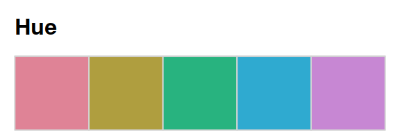
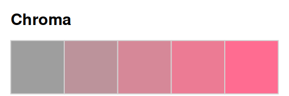
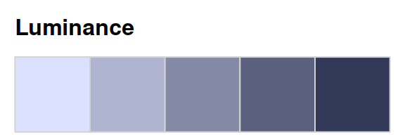
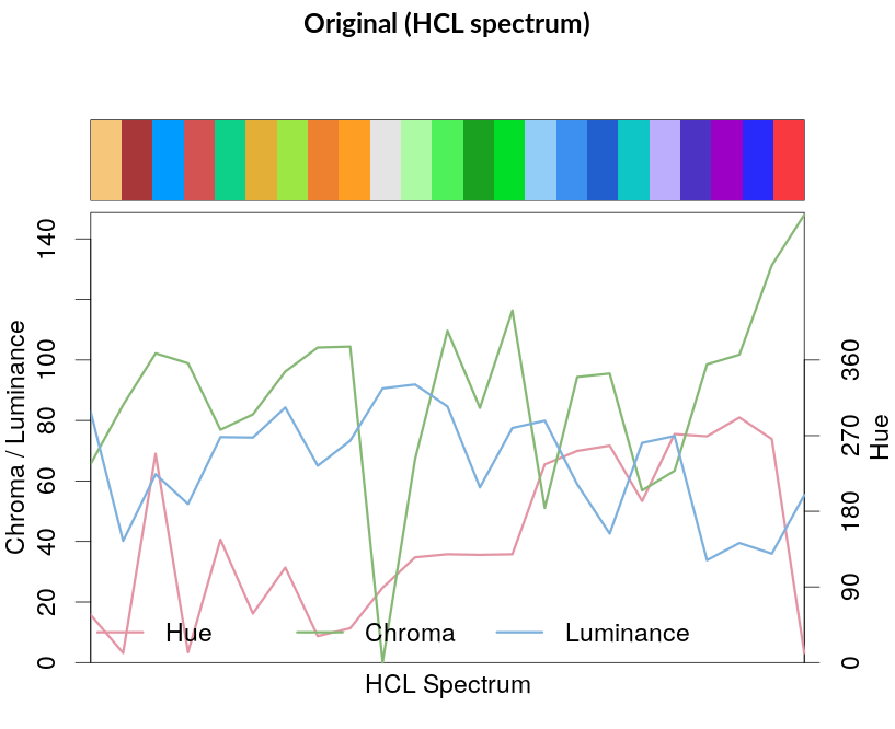
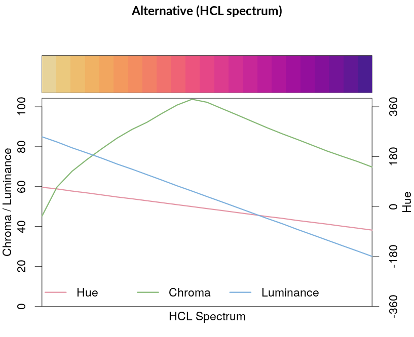
HCL Color Space
The HCL Wizard provides tools for manipulating and assessing colors and palettes based on the underlying colorspace software available in R (Zeileis et al. 2020) and Python (Stauffer and Zeileis 2024). It leverages the HCL color space, a color model that is based on human color perception and thus makes it easy to choose good color palettes by varying three color properties: Hue (= type of color, dominant wavelength) – Chroma (= colorfulness) – Luminance (= brightness).
As shown in the color swatches below each property can be varied while keeping the other two properties fixed.
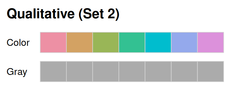
Color Palettes
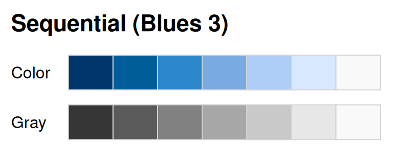
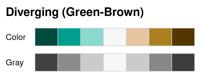
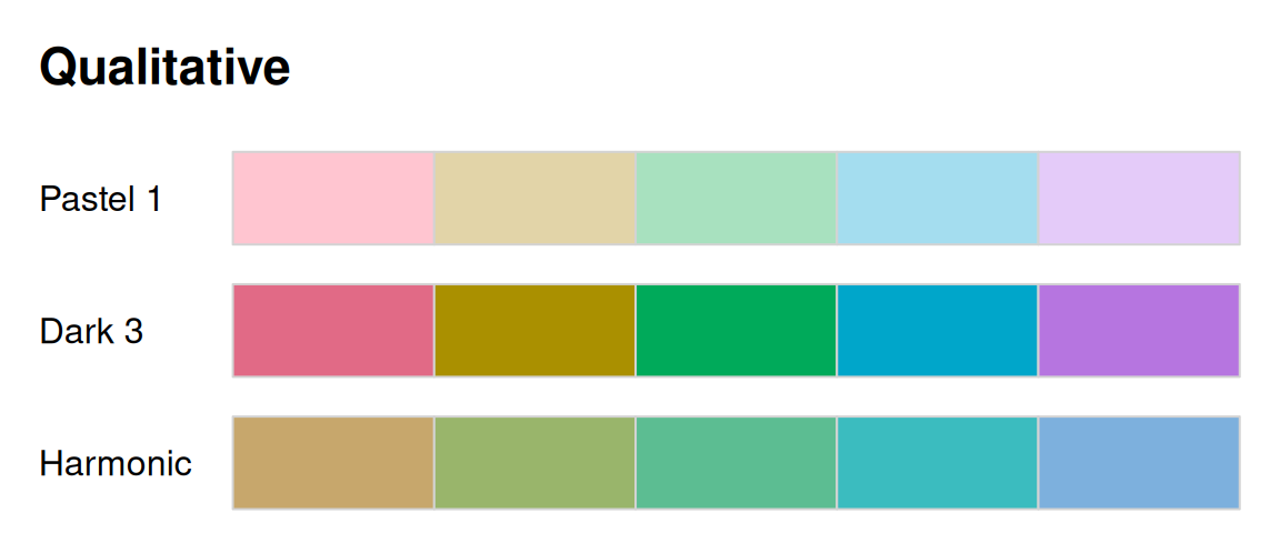
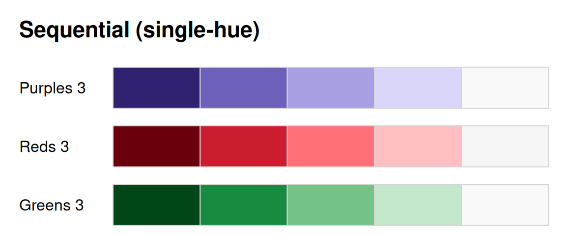
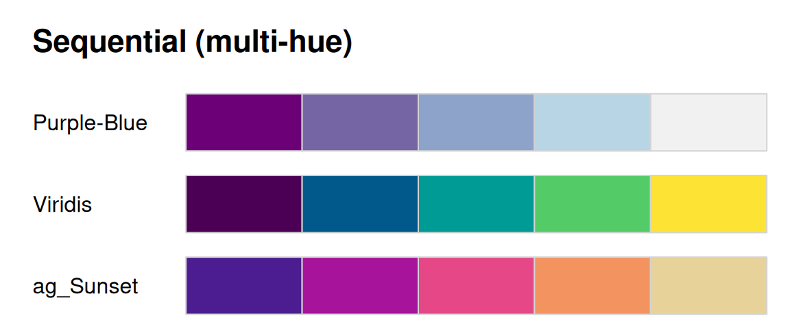
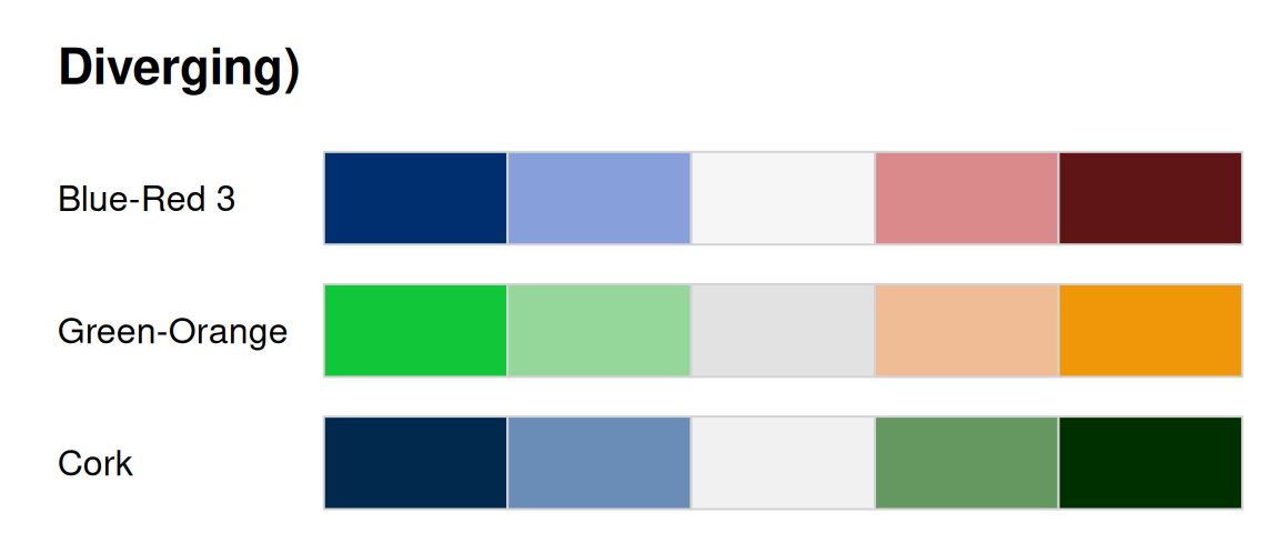
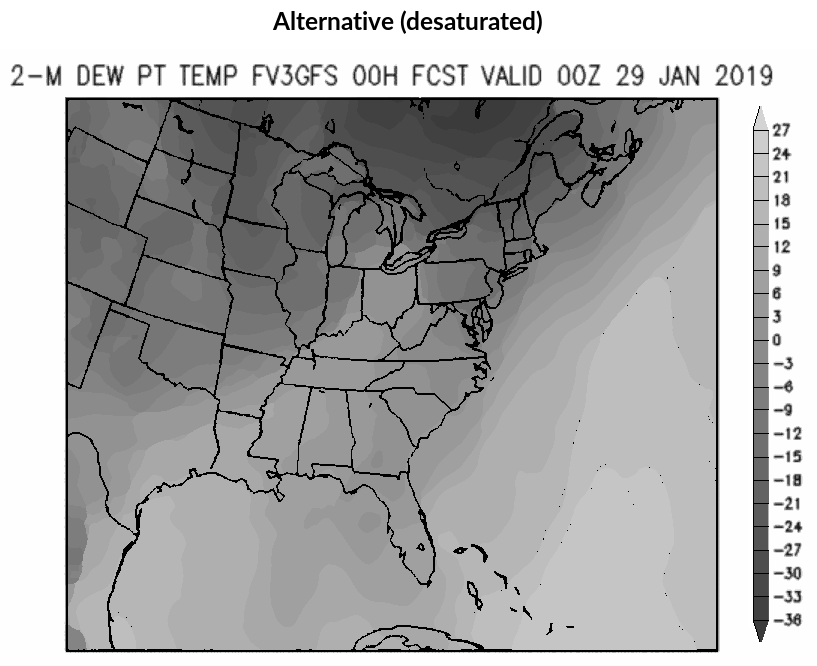
For color coding data visualizations it is crucial to choose palettes that appropriately capture the underlying information. Three types are commonly distinguished: Qualitative palettes for coding categorical information, i.e., where no particular ordering of categories is available and every color should receive (approximately) the same perceptual weight. Sequential palettes for coding ordered/numeric information, i.e., where colors go from high to low (or vice versa). Diverging palettes for coding numeric information around a central neutral value, i.e., where colors diverge from neutral to two extremes. The type of palette is determined by luminance differences (= light-dark contrasts, or the lack thereof), as shown in the version below, desaturated to a grayscale.
Examples
By choosing suitable trajectories along the hue, chroma, and luminance axes of the HCL color space, a wide variety of HCL-based color palettes can be designed. Some further examples are provided below.
Somewhere over the Rainbow
The go-to palette in many software packages is – or used to be until rather recently – the so-called rainbow: a palette created by changing the hue in highly-saturated RGB colors. This has been widely recognized as having a number of disadvantages including: abrupt shifts in brightness, misleading for viewers with color vision deficiencies, too flashy to look at for a longer time. For more details and further pointers see “The End of the Rainbow” by Hawkins (2014) or “Somewhere over the Rainbow: How to Make Effective Use of Colors in Meteorological Visualizations” by Stauffer et al. (2015) as well as the #endrainbow hashtag on X (Twitter).
In a nutshell, the (in-)famous RGB rainbow palette is virtually always a poor choice and properly balanced qualitative, sequential, or diverging palettes - such as the HCL-based palettes provided here – are preferable. Despite such alternatives becoming more and more widely available the rainbow palette is unfortunately still widely used. Below we show some wild-caught examples, highlight their problems (e.g., by desaturation to grayscale or by emulating color vision deficiencies), and suggest better alternatives.
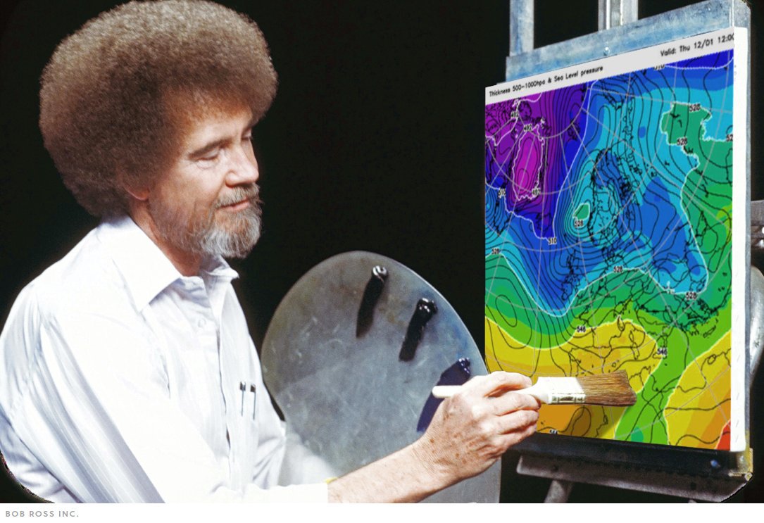
Would Bob Ross Approve?
When you see a (scientific) data visualization with a rainbow, ask yourself: Would Bob Ross approve of this?
Most likely not. In contrast, choosing a HCL-based palette instead will yield less flashy colors that change smoothly … very much in the spirit of The Joy of Painting.
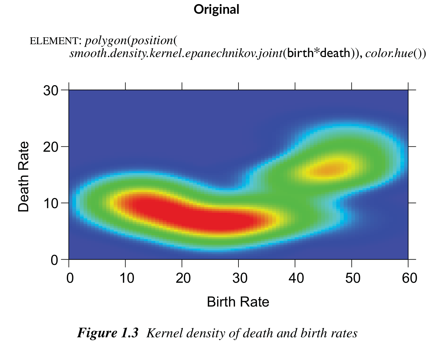
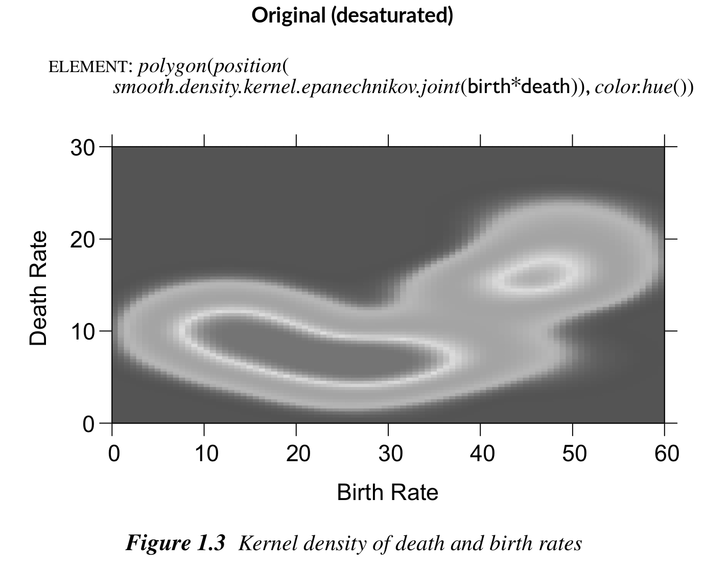
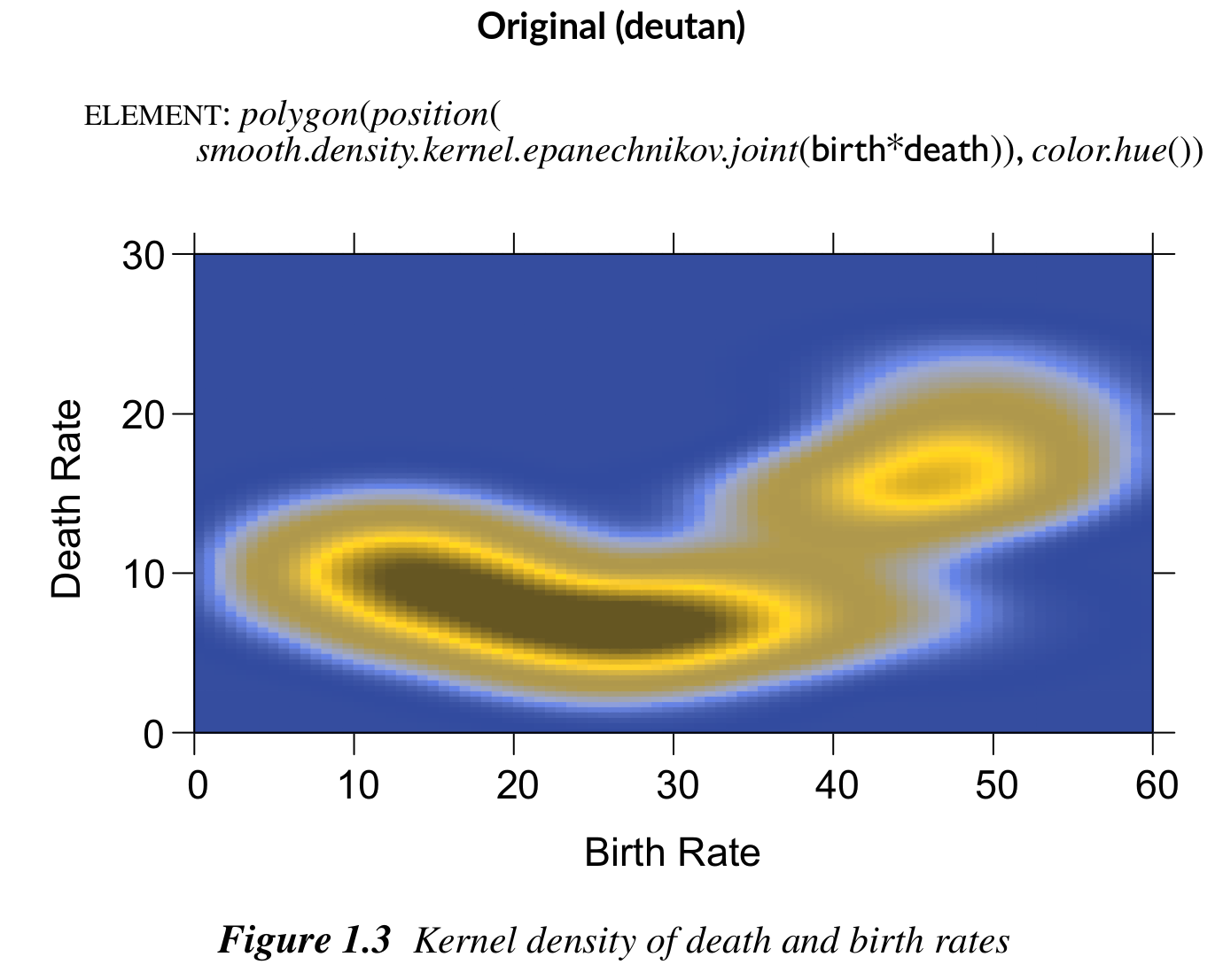
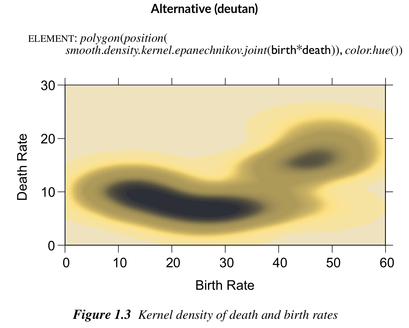
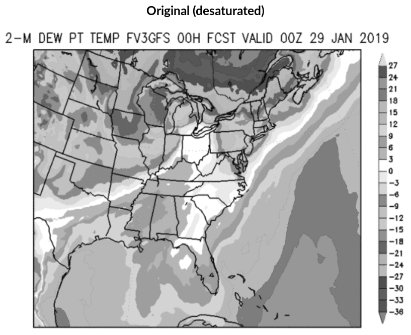
Heatmap from The Grammar of Graphics
Even in the excellent book The Grammar of Graphics by Wilkinson (2005), the rainbow palette is used in one of the first figures, depicting a heatmap of a bivariate kernel density estimate.
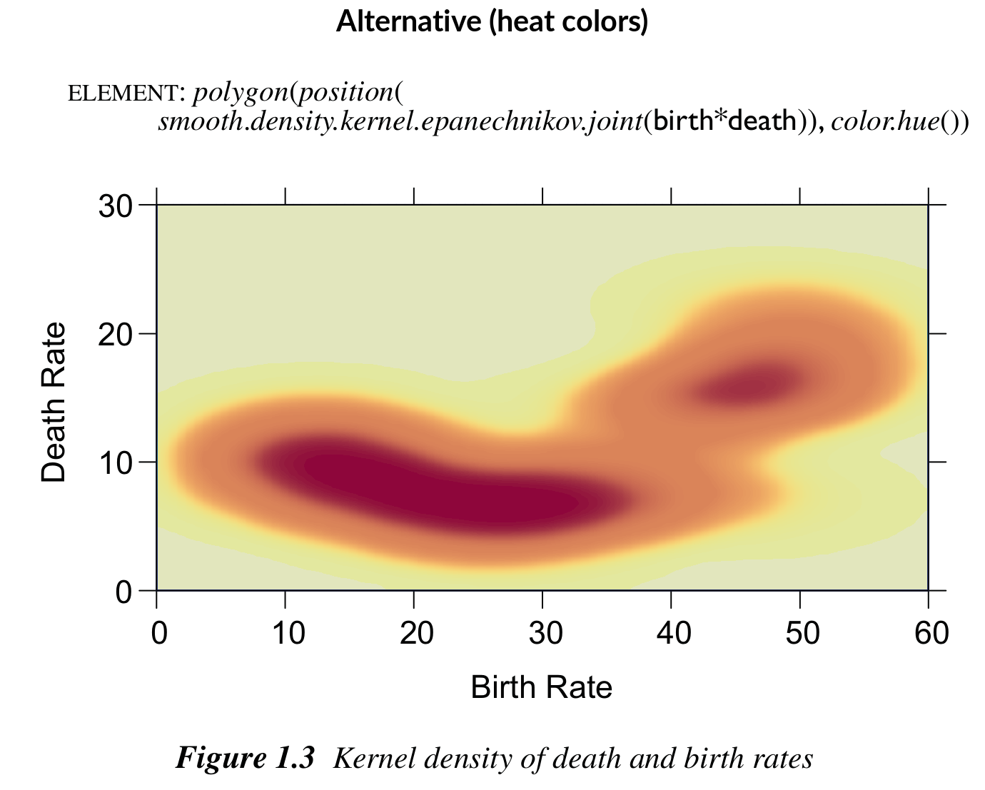
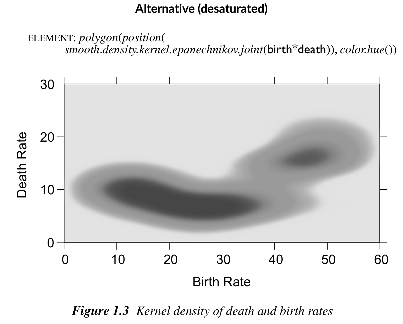
The original palette changes back and forth between dark and light colors and works poorly for colorblind viewers. A better alternative would be a sequential heat colors palette. It goes from light to dark and hence also works well for colorblind viewers.
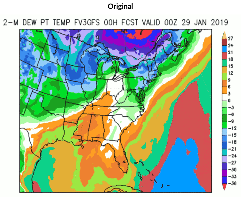
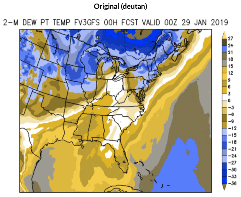
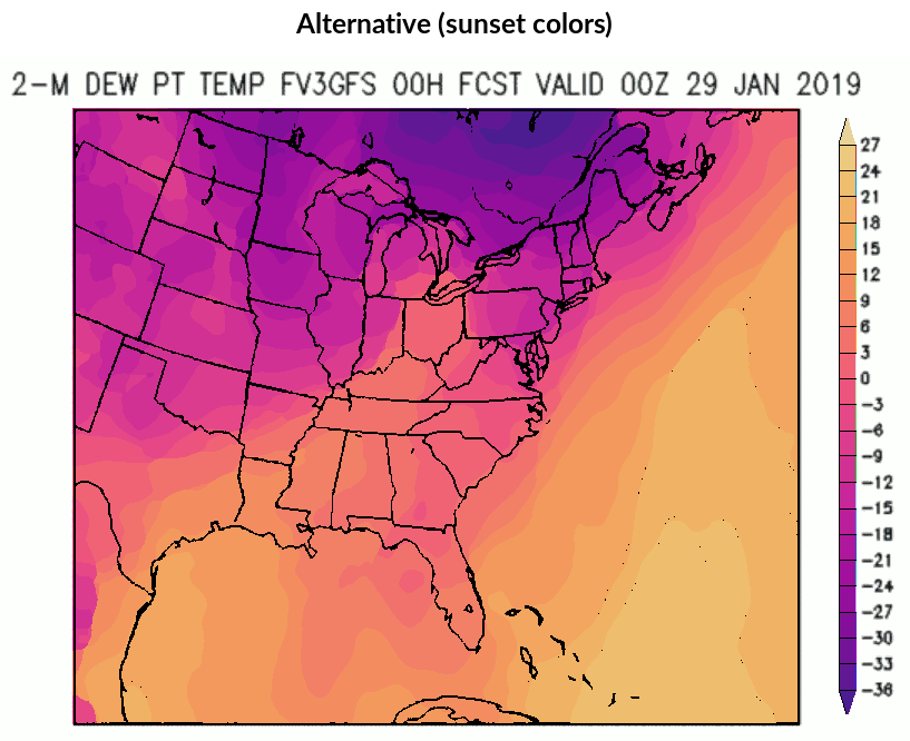
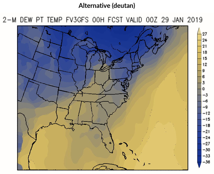
Weather Map
Weather forecasts are often communicated through shaded maps. As an example the dewpoint temperature forecast (NOAA EMC 2008) from a certain FV3 Global Forecast System (GFS) product is shown. It does not use a standard rainbow but the palette is also composed of highly-saturated colors with a wide range of hues.
The original palette abruptly changes hue, chroma, and luminance and hence does not convey a continuous temperature scale. Instead the HCL-based sunset palette is also built from a wide range of hues but changes hue, chroma, and luminance smoothly. This also works well in grayscale or for colorblind viewers.
References
Hawkins, Ed. 2014. “The End of the Rainbow.” Climate Lab Book. https://www.climate-lab-book.ac.uk/2014/end-of-the-rainbow/.
NOAA EMC. 2008. “NAM Vs. FV3GFS Vs. GFS Comparisons: West CONUS 2-m Dew Point Temperature.” https://www.emc.ncep.noaa.gov/.
Stauffer, Reto, Georg J. Mayr, Markus Dabernig, and Achim Zeileis. 2015. “Somewhere over the Rainbow: How to Make Effective Use of Colors in Meteorological Visualizations.” Bulletin of the American Meteorological Society 96 (2): 203–16. https://doi.org/10.1175/BAMS-D-13-00155.1.
Stauffer, Reto, and Achim Zeileis. 2024. “colorspace: A Python Toolbox for Manipulating and Assessing Colors and Palettes.” Journal of Open Source Software 9 (102): 7120. https://doi.org/10.21105/joss.07120.
Wilkinson, Leland. 2005. The Grammar of Graphics. 2nd ed. Springer-Verlag.
Zeileis, Achim, Jason C. Fisher, Kurt Hornik, Ross Ihaka, Claire D. McWhite, Paul Murrell, Reto Stauffer, and Claus O. Wilke. 2020. “colorspace: A Toolbox for Manipulating and Assessing Colors and Palettes.” Journal of Statistical Software 96 (1): 1–49. https://doi.org/10.18637/jss.v096.i01.
See references for the most important references and further reading.