Why HCL
The standard way: RGB color space
Everyone who is frequently working with colors is familiar with the Red-Green-Blue (RGB) color space (or color gamut). Each RGB color is defined as a triplet composed of intensities for red, green and blue wavelengths. This is mainly based on how computer and TV screens are built where each pixel is a combination of three light sources. If just one of the three colors is on the maximum intensity and the others are zero, the resulting color is either pure red, pure green or pure blue.
The main problem of the scheme: it is not based on how the human eye perceive colors. This can lead to several problems when using RGB based color palettes. One possible solution is to switch to another color space. First idea: using HSV or HSL. The abbreviations stand for Hue-Saturation-Value (HSV) and Hue-Saturation-Luminance (HSL) and those are often used for color pickers. The basic problem: as mentioned by the name, they are based on saturation. Thus, those color spaces do not solve the main problem of the RGB color gamut.
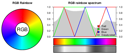
RGB rainbow with corresponding spectrum.
The figure above shows the default RGB rainbow. On the right hand side the spectrum of the rainbow is shown. The color palette is a superposition of the intensities of red, green and blue wavelengths. Additionally, the desaturated version of the color palette is shown. It represents the resulting luminance of the different colors. This points to one of the main problems: the underlying luminance of RGB colors is highly discontinuous.
The perceptual-based way: HCL color space
The human eye has about five million cone cells to capture color (red, green and blue wavelength) and about 20 times more rod cells to capture luminance (dark/bright). The Hue-Chroma-Luminance (HCL) color space is based on how the human perception works. When using HCL, you can directly control the color (hue), the colorness (chroma) and the luminance (brightness). Thus we can avoid many problems produced by RGB color palettes.
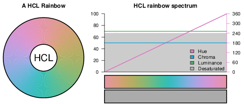
HCL color rainbow similar to the often used RGB rainbow.
A HCL rainbow similar to the RGB rainbow shown above is given here. Beside, the spectrum is shown. Compareable to the RGB definition each HCL color is defined by a triplet of values. The values are Hue (defines the color, [0-360]), Chroma (defines the colorness; restricted to [0-100] here) and Luminance (defines the brightness, [0-100]). The desaturated version of the color palette shows that we can explicitly control the luminance information.
Real world example
To give you an idea we took a “random” image from the web. The image shown in panel (A) was published on the public website of the National Oceanic and Atmospheric Administration (NOAA) during the landfall of hurricane Sandy in 2012. It shows the 120 hour accumulated precipitation (sum of precipitation over the next 120 hours).
If one is already familiar with this special type of product in panel (A), one can quickly identify regions with low precipitation amounts (vivid green colors) and those with high amounts of precipitation (reddish colors) – but it is hard to grasp the message of the whole figure at once, especially if one is looking at this plot for the first time. One has to scan the entire image and translate the different shiny colors into its values to get an overall idea of the information shown. The reason therefore are the used colors here. On the right hand side of the original color you can see the desaturated representation in panel (B). To highlight a few problems of the originally used color scheme:
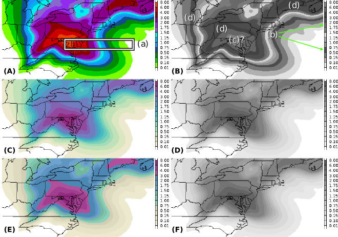
A 120 hour rainfall amount forecast (in inches) during landfall of hurricane Sandy in 2012. Left: original colors on top; desaturated version below. Right: modified version using HCL color scheme; colorized and desaturated version. Source: [[www.noaa.gov]].
If one is already familiar with this special type of product in panel (A), one can quickly identify regions with low precipitation amounts (vivid green colors) and those with high amounts of precipitation (reddish colors) – but it is hard to grasp the message of the whole figure at once, especially if one is looking at this plot for the first time. One has to scan the entire image and translate the different shiny colors into its values to get an overall idea of the information shown. The reason therefore are the used colors here. On the right hand side of the original color you can see the desaturated representation in panel (B). To highlight a few problems of the originally used color scheme:
- (a) very strong gradients between colors;
- highly saturated colors;
- luminance: bright, dark, bright, dark, …
- (b) color/value pairs no longer unique
- (c) identification of most important information difficult/impossible
- (d) eye automatically focuses on dark “artefact’s”
As an alternative we added two alternative color schemes in panel (C) and (E) based on HCL color palettes. The data shown here are continuous data between 0 (no rain at all) up to several inches over the next 120 hours. Therefore, a sequential or multihue sequential scheme fits the best. The underlying concept:
- (1) decreasing luminance with higher values (high amounts of rain: darker areas)
- (2) increasing chroma with higher values (grayish colors on the lower side of the value range)
- (3) additional hue to support the user task
The monotone decrease in luminance leads to a “shape” which can rapidly be recognized by the human visual system. On top color is used to support the reader in its task. In this example we took two synthetic but realistic user taks:
- Panel (C) the plot is for a more advanced decision maker or scientist. The change in hue and chroma over the whole color map is linear. The user has its own hypothesis and the plot should not distract him.
- Panel (E) is for a less advanced user, e.g., the people in the area or decision makers like civil protection service or local fire fighters. The plot already offers three different thresholds which can be of interest to take some action in advance of this event. The difference to the color map in panel (C): here, hue and chroma increase in a cascade with four different levels and the three thresholds at 0.74/1.5/3.0 inches per 120 hours.
- Panel (D) and (F) display the desaturated versions of the plots to their left. Note that those two images are identical because we have not changed the underlying luminance between panel (C) and (E). This shows that the used color scheme also works on grayscale printers/mediums.
Color schemes in HCL coordinates for panel (A), (C), (E)
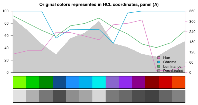
The original color scheme used by NOAA transfered from the RGB color space into the HCL color space.
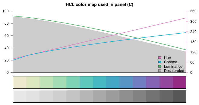
First alternative color scheme used in panel (C). Monotone increase/decrease in all three dimensions over the whole color map.
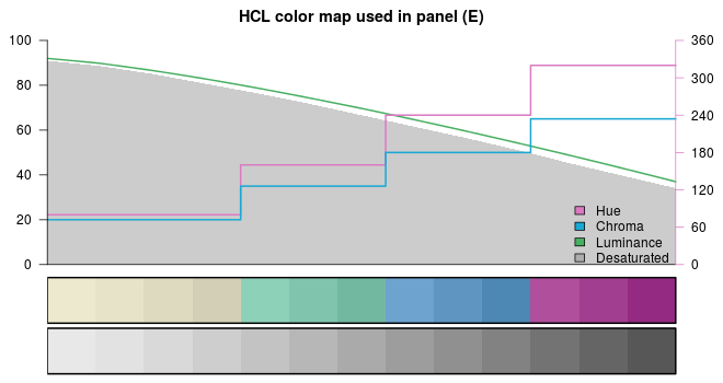
Second HCL alternative. As shown, hue and chroma are increasing stepwise to highlight some thresholds or areas of interest.
